


Solo Exhibitions (Brief)
In 1999, he held his first solo exhibition, 《hee hee hee》 (1999, Gallery Jo, Seoul, Korea) at the Jo Sung-hee Gallery. It was an exhibition that well expressed the purpose of the work that the artist had in the beginning. The artist wanted to continue to work with the thoughts and mindset he had at the beginning, and this was the exhibition that best suited it.
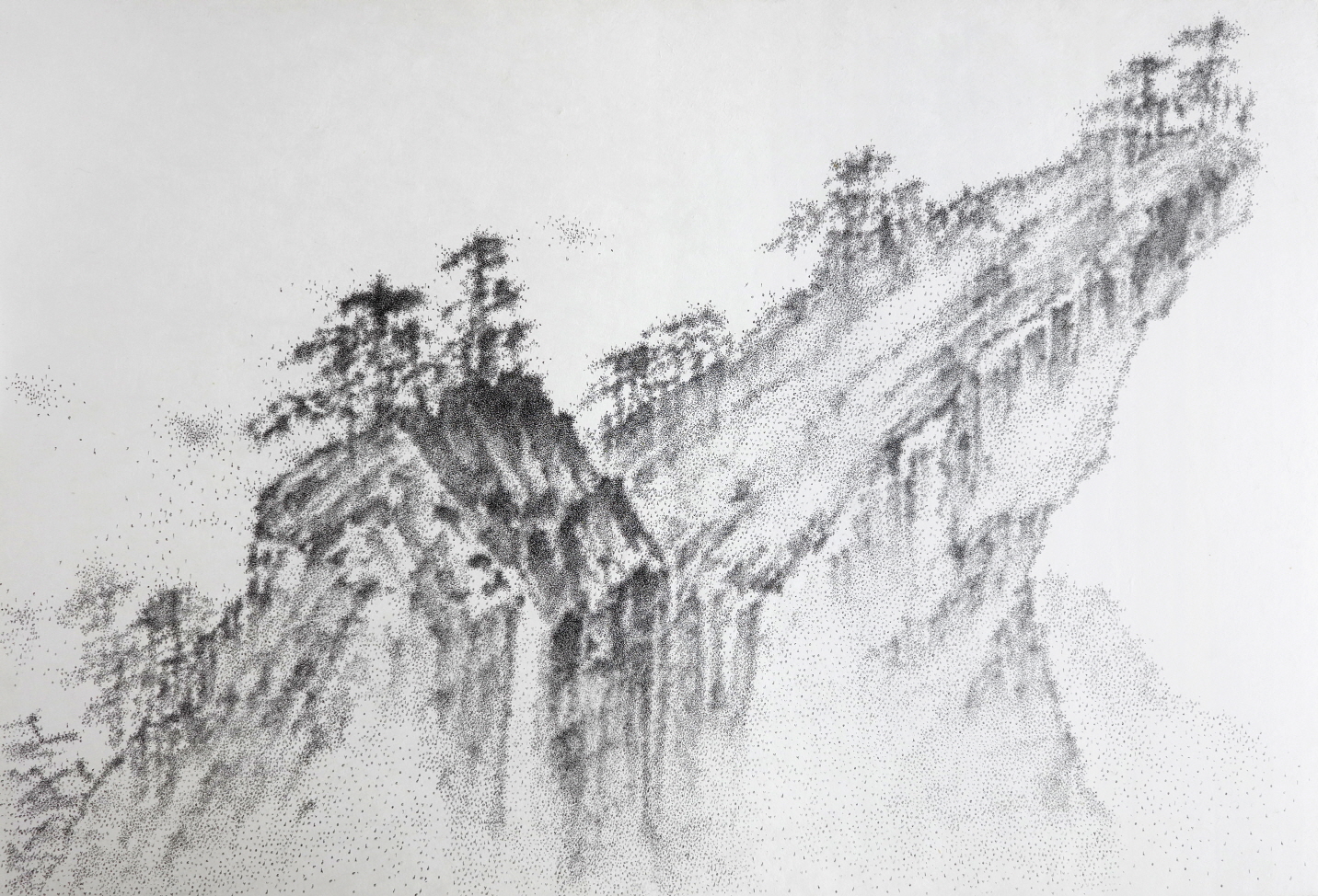
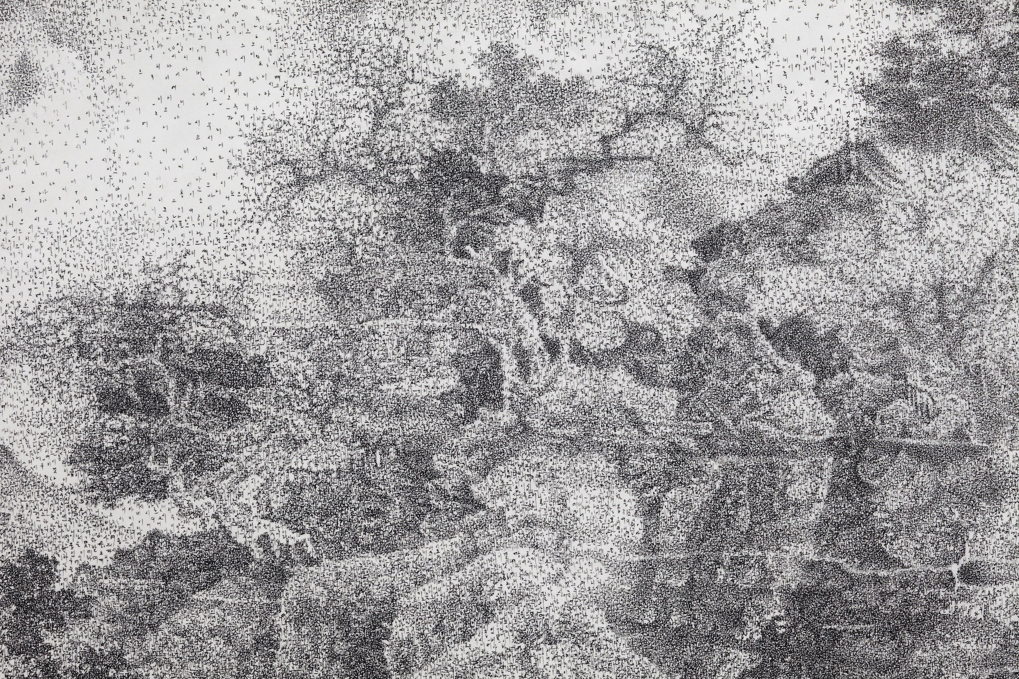
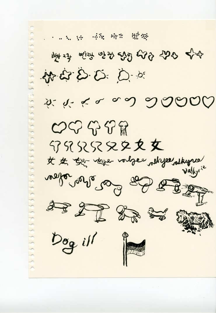
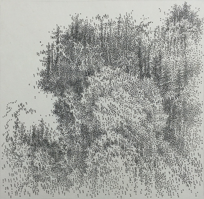
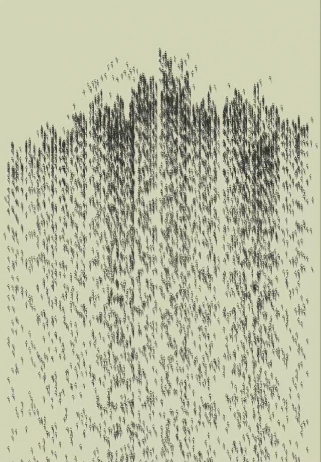
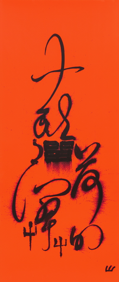
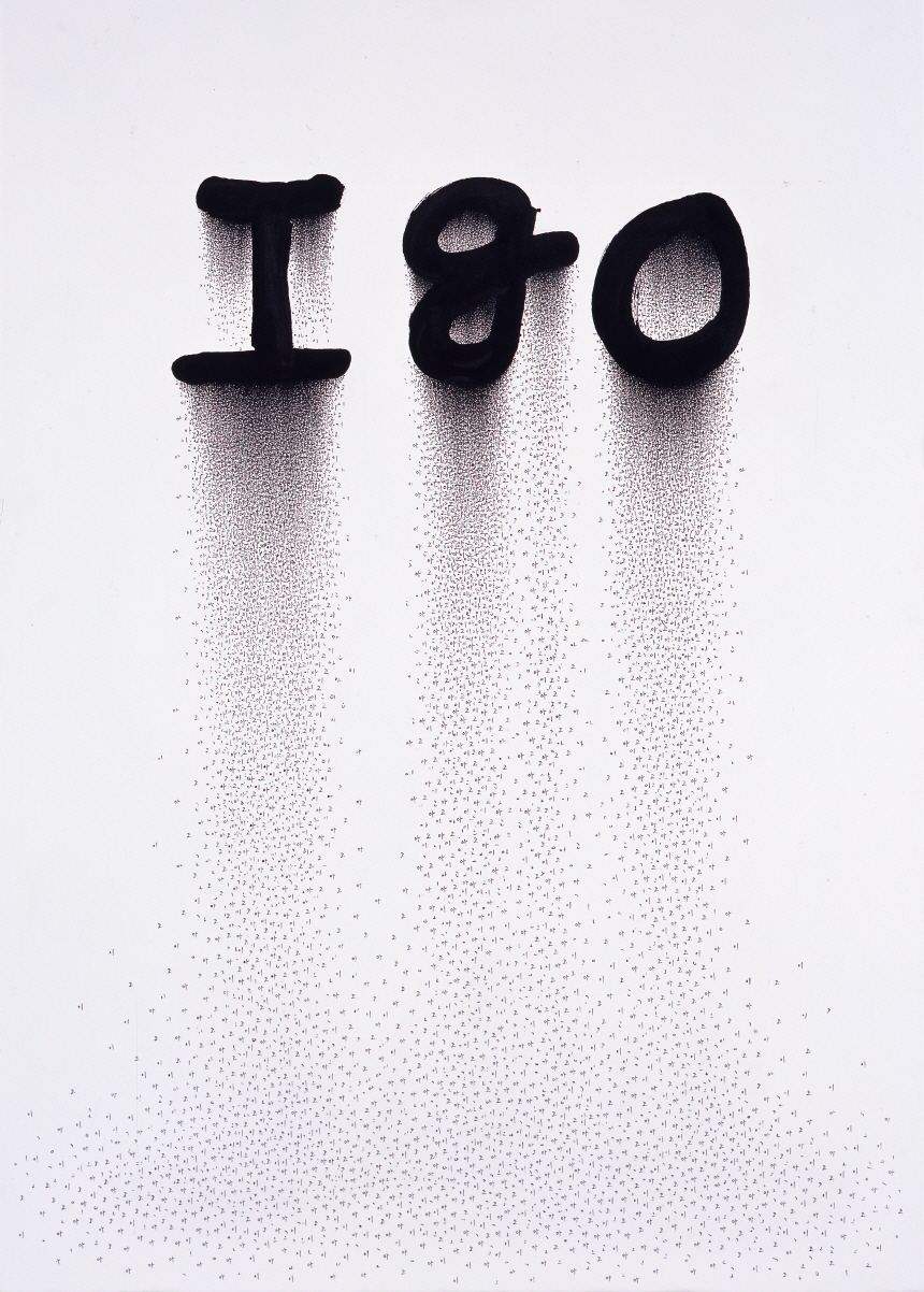
In 2005, 《echowords》 exhibition was held at One and J Gallery. In this exhibition, two series of ‘Text Landscape’ and ‘Text Play’ were presented. ‘echowords’ has a dictionary meaning of ‘words to imitate’ and is a representative term for his drawings made up of meaningless words such as onomatopoeia and mimic words.
The artist also participated in the residency program at Doosan Gallery New York, where he held 《echowords》 (2013, Doosan Gallery, New York, USA). The artist pays attention to the interrelationship between the words written in the work and the images seen there. The word ‘echowords’ means that words can imitate images, images can imitate words, and it can also be some interaction between the two.
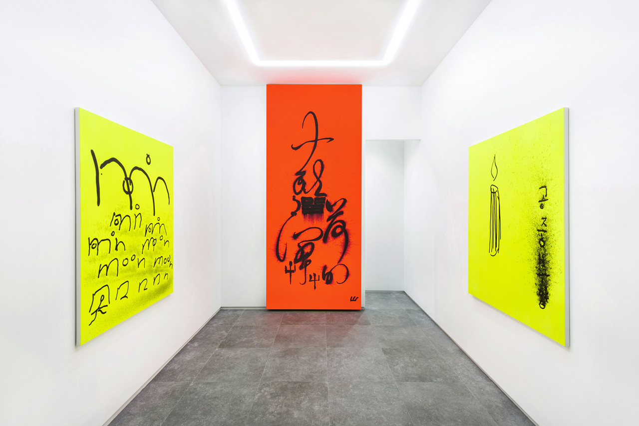
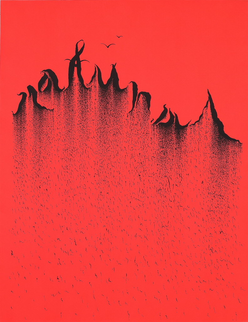
In 2017, he held a solo exhibition titled From Head to Toe at P21. In this exhibition, the ‘Text Play’ series was mainly composed of calligraphic shapes using Chaucer among calligraphic typefaces. ‘Text Play’ is a playful work that looks like a childish pun that comedians or children play.
For example, indicates a cerebrovascular disorder caused by cerebral blood vessel bleeding, but in English, it is also pronounced as ‘natural’, meaning ‘natural’. is an onomatopoeic word for pressing her urine, but in English it means ‘she’.
Group Exhibitions (Brief)
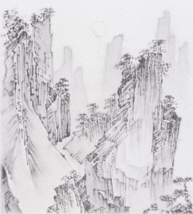
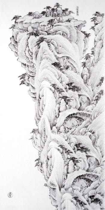
The artist participated in the group exhibition 《Kongsan Art Festival》 held at Dong-Ah Gallery in 1998. This exhibition was the first time the artist presented her work to the public. Because the work creates an image as text and forms a pixel unit with dots, it gives a different feeling from existing painting, so I thought that people felt it anew and received a good response.
After presenting his work in this exhibition, the artist gained confidence and confidence in his work.
Participated in the exhibition 《Oriental Metaphor》 (2006, Alternative Space Loop, Seoul, Korea) in 2006. 11 artists from Korea, China, Japan participated and toured in Korea, China, and Japan. As Asian art begins to play an active part on the world stage, “Why is contemporary Asian art attracting attention?” This exhibition was planned from the question.
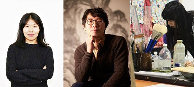
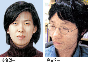
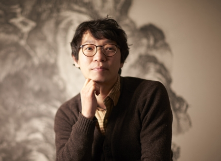
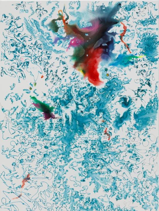
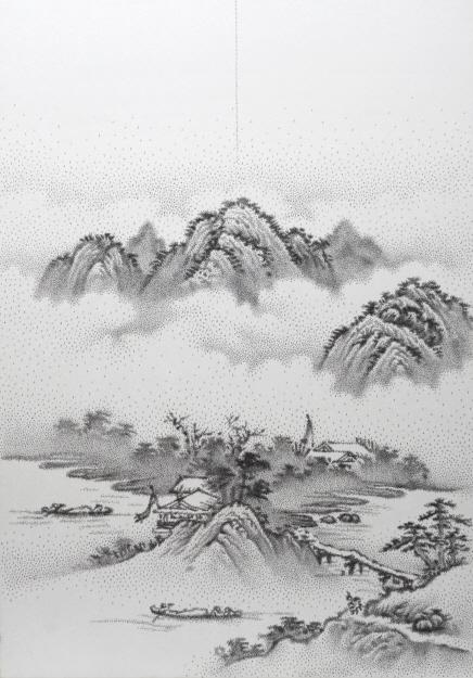
In 2014, Doosan Gallery Seoul participated in the two-person exhibition 《CLOSE-UP》 with artist Ham Jin (2014, Doosan Gallery, Seoul, Korea). Yoo Seungho presents a painting in which small letters written in ink on paper are gathered to create a landscape.
Through the works of Yoo Seungho and Ham Jin, who individually reveal their distinct styles by employing methods of expansion and repetition, and reduction and transformation, this exhibition presents viewers with a perceptive experience that differs depending on the distance from which one views an artwork, and brings viewers face-to-face with the hidden world that exists beneath an image’s surface.
In addition, 《Beginning of New Era》 (2009, National Museum of Modern and Contemporary Art, Seoul, Korea), 《Korean Alphabet: The Art of Inspiration and Interaction》 (2013, Seoul Museum of Art, Seoul, Korea), 《Hangeul Calligraphy x Latin Typography》 (2016, Seoul Arts Center Seoul Calligraphy Art Museum, Seoul, Korea), 《The Elegance of Silence》 (2005, Mori Art Museum, Tokyo, Japan), etc. Participated in several group exhibitions held at home and abroad.
Awards (Selected)
The artist won Excellency Reward at the 5th Kongsan Art Festival in 1998 and the 22nd ‘The 22th Suk Nam Arts Prize’ in 2002.
The 22th Suk Nam Arts Prize is selected by the Suk Nam Art and Culture Foundation for young artists under the age of 35, and the artist was selected at the young age of 28.
Collections (Selected)
National Museum of Modern and Contemporary Art (Seoul, Korea), Burger Collection (Hong Kong, Hong Kong) Seoul Museum of Art, (Seoul, Korea), Doosan Gallery (Seoul, Korea), Mori Art Museum (Tokyo, Japan), Museum of Fine Arts (Houston, USA), other collections have been.