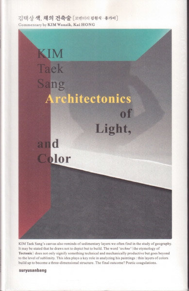
Articles
[Critique] The Length of Light, the Duration of Color
2018
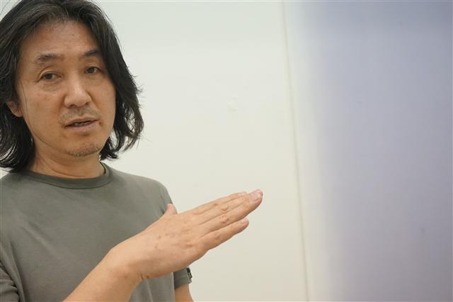
Choi Jae hyuk | Public Art Guest Reporter
Kim Taek Sang’s artistic journey began with an encounter at Yellowstone National Park in the United States. The Grand Prismatic Spring—designated a UNESCO World Heritage site—is renowned for its spectacular colors. Measuring nearly 90 meters in diameter, its rim forms layers ranging from red to orange to yellow. These bands extend from the ground’s surface down into the water, where, at depths reaching 50 meters, they shift into greens, emerald tones, and blues, creating a mesmerizing beauty.
The colors at the surface are revealed by strata of bacteria living in the spring, while the colors on the water’s surface become visible through the scattering of light. This multicolored lake seems to have been transferred onto the canvases scattered across the floor of the artist’s studio. The canvases, submerged in water diluted with various pigments, lie in a quiet, gentle sway.
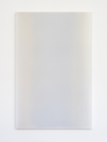
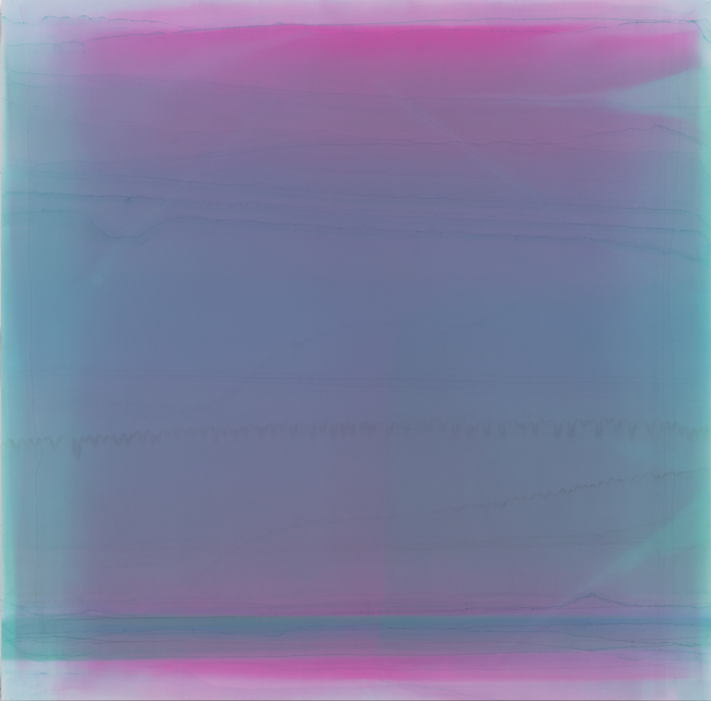
Kim’s work does not simply pursue the color of a given subject. He is concerned with how we perceive “light” and how it can be represented. When we attempt to depict “water-light,” for instance, the color that most closely evokes the qualities of water, among those we perceive, is blue. Accordingly, his early works largely carry blue tonalities. Of course, air and water themselves have no color; they appear blue due to the scattering of light. When sunlight collides with particles such as nitrogen and oxygen in the atmosphere, shorter-wavelength blue light—denser and more readily scattered—allows us to see a blue sea. At sunset, when the path between the sun and the earth becomes longer and more oblique, red light dominates, turning the sky crimson.
After grasping this principle, the artist freed himself from the colors that appear on the surface of things. In other words, rather than merely reproducing the colors we see, he seeks to capture the process by which color is derived through the mediation of light. This approach can be understood through the work Breathing light-Air, whose title suggests “capturing the color of air.”
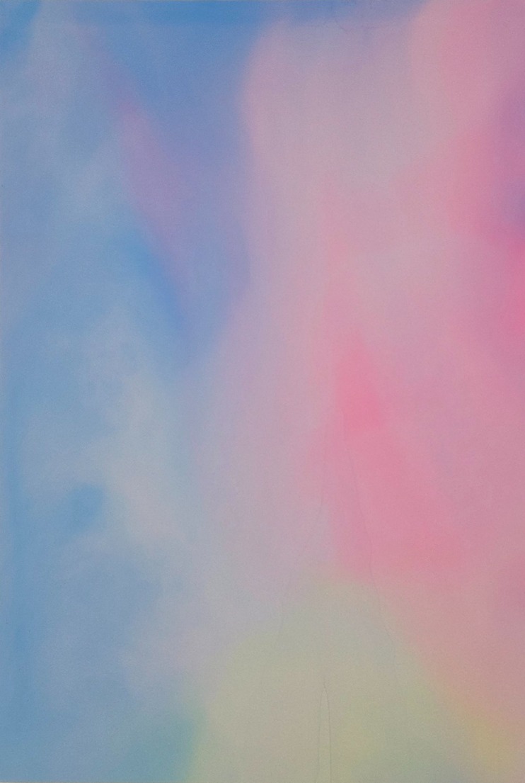
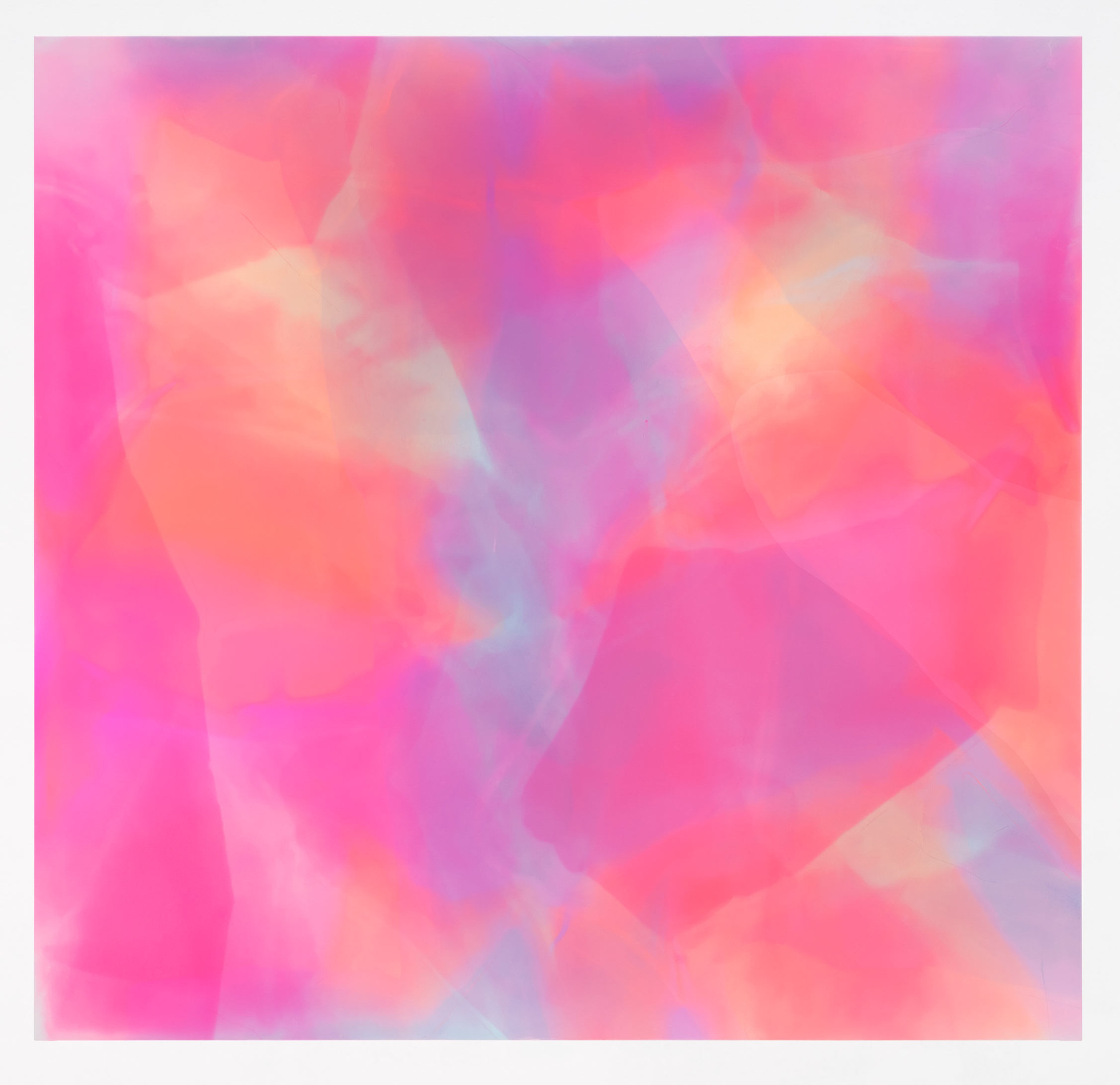
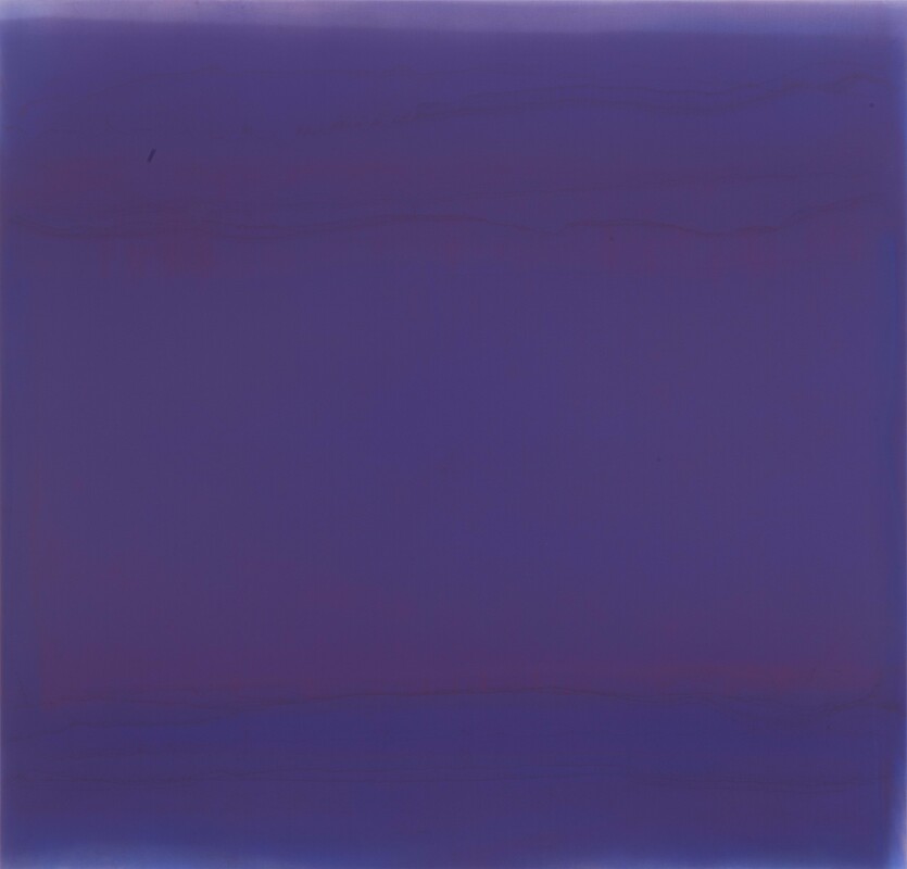
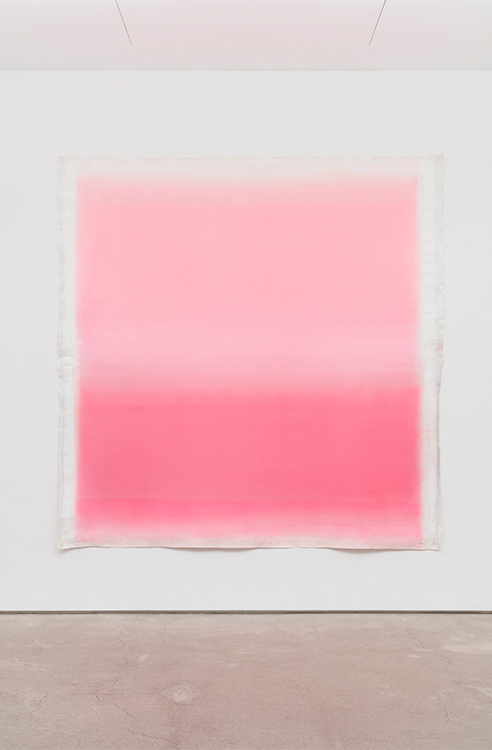
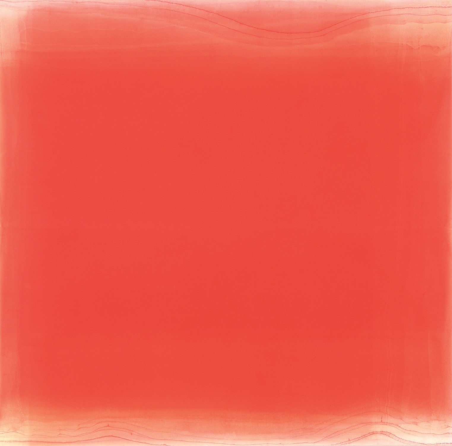
Kim Taek Sang, Breathing hue-red in the blue, 2015, Water, acrylic, urethane, and epoxy on canvas, 59 x 54.5 cm © Kim Taek Sang
Korean Conditions: Not Painting, but Building Up
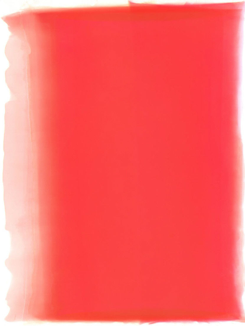
The process of making the work demands not only long durations of time, but also patience and delicacy. First, a specially prepared watercolor canvas cloth is spread out on the floor. Acrylic paint in the desired color is then thinly diluted in water and poured onto the canvas. Beneath the fabric, vinyl flooring, sponge, and bricks are used to create a slight incline so that the water can pool shallowly. As time passes, the pigment particles settle and the water separates from the color; the artist then carefully pours the water off.
When the remaining moisture is fully removed using natural light, the sedimented color finally forms a thin layer. This process is repeated dozens of times. Each layer is sometimes varied and overlapped, and as numerous strata accumulate, an elusive, complex hue emerges. (If one looks closely at the edges of the surface, each layer can be found.) The artist traces the origins of this method to the “local conditions” (pungtoseong) embedded in Korean art across history.
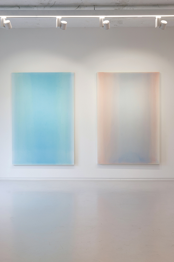
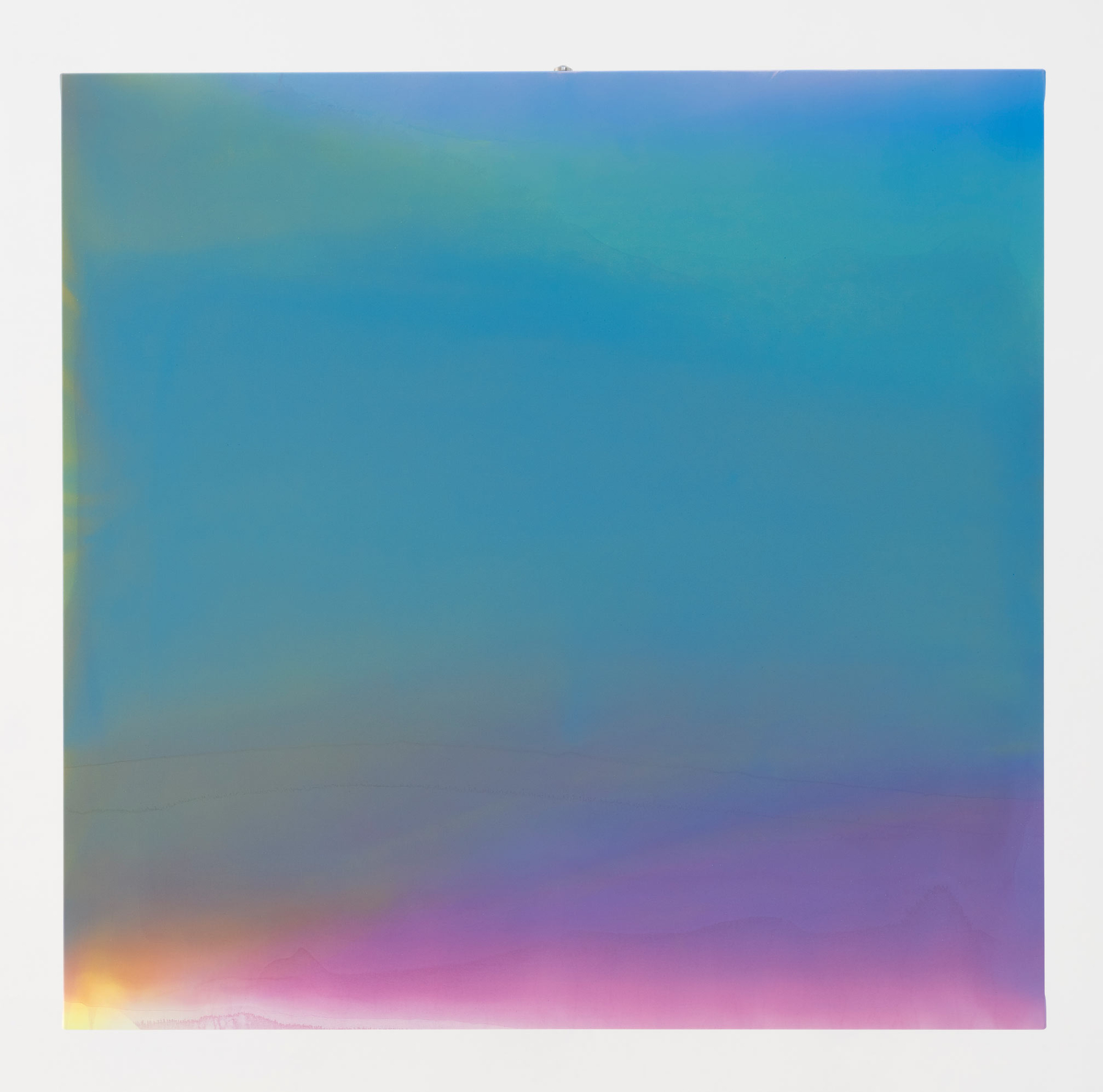
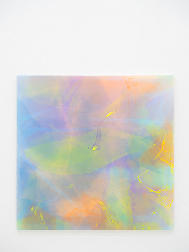
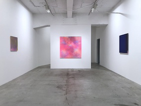
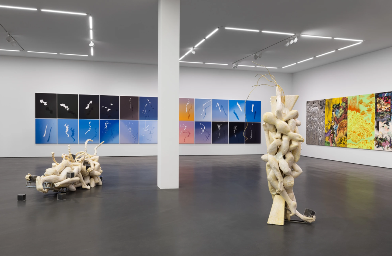
Installation view of 《Damsaekmulsung》 © Gallery Woong
Goryeo Buddhist paintings employed the technique of baech’aebŏp (back-coloring), and Joseon-dynasty portraits developed yukrimun, a traditional approach to shading that renders the form and color of skin. Gentle tones are built across the face, and countless brushstrokes create minute gradations. Toward the edges of the face, darker hues follow the grain of the skin, expressing a subject’s features with richness and subtlety. This is not merely a technical trait once practiced by court painters; it is part of a tradition in Korean art aimed at conveying a sitter’s character and spirit. Goryeo celadon offers another example.
Its celebrated bisek—a pale bluish-green—emerges as the gray-blue clay body merges with faint greens and bright gray-blue tones, meeting the refraction of light through glaze to produce an enigmatic radiance. This lucid quality is perceived differently from “color” alone, as suggested by the way we often praise celadon not by saying “the color is good,” but “the light-tones are beautiful.” Kim Taek Sang likewise describes his practice as an approach that privileges the accumulation of “strokes” over “lines,” and the realization of “light-tones” over “color,” because he believes culture and art are most natural when they arise from a country’s life and history.
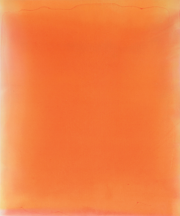
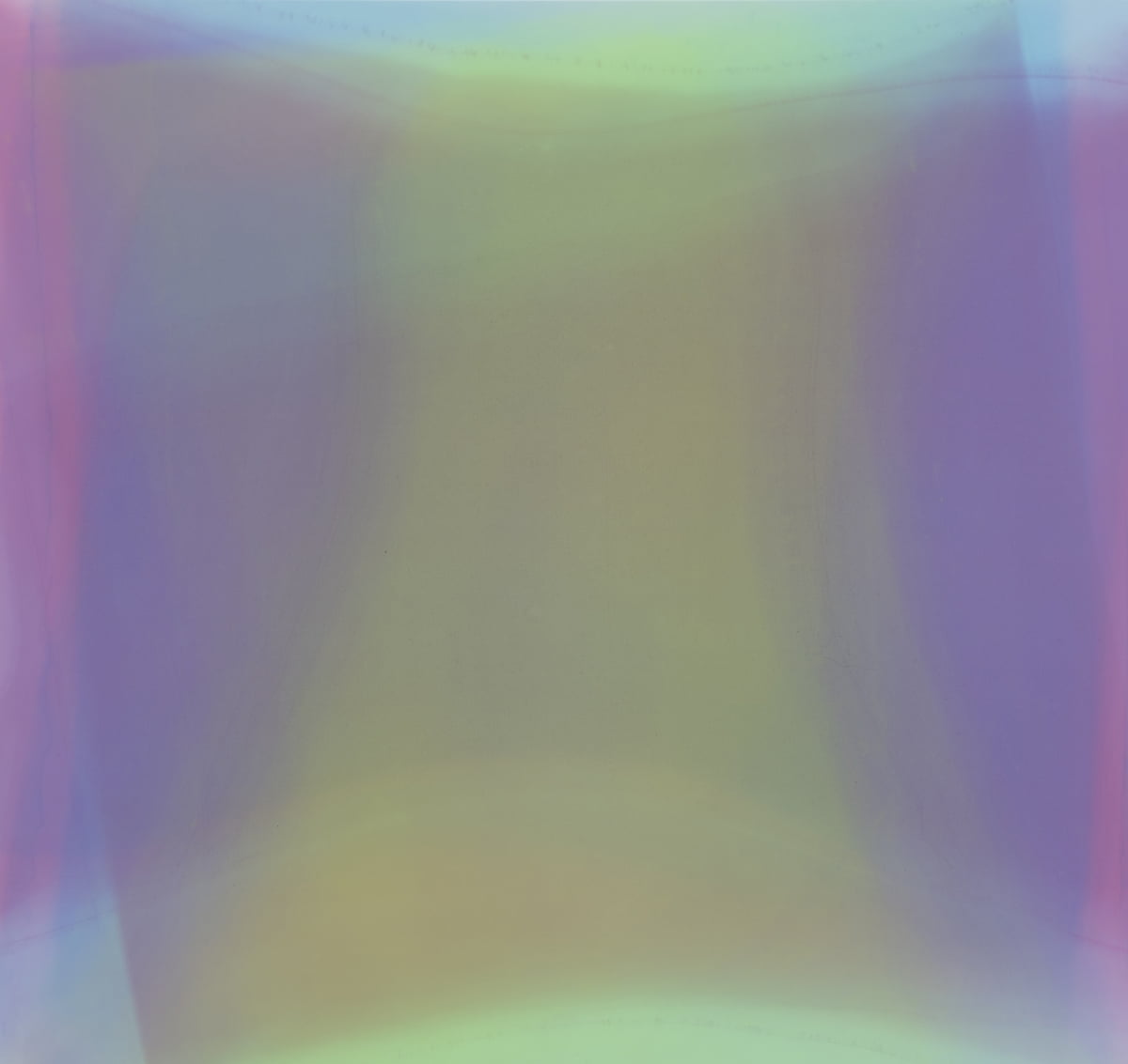
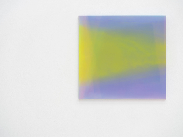
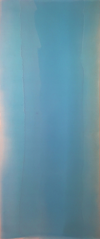
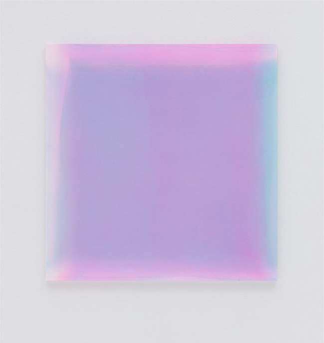
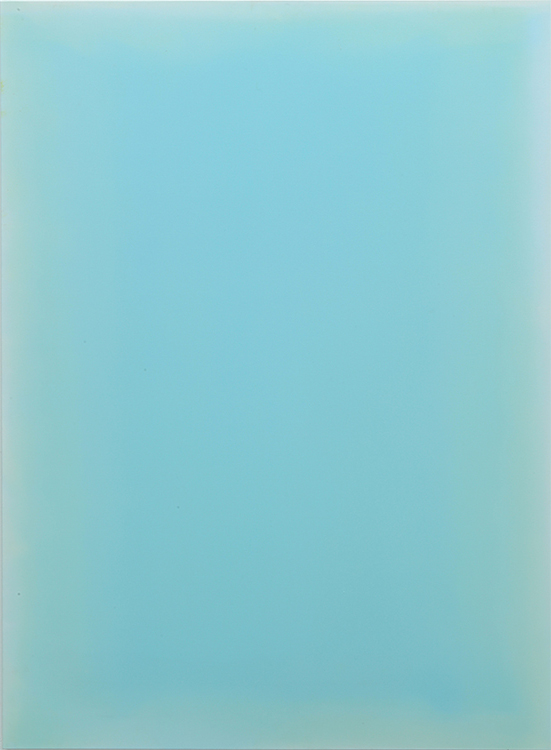
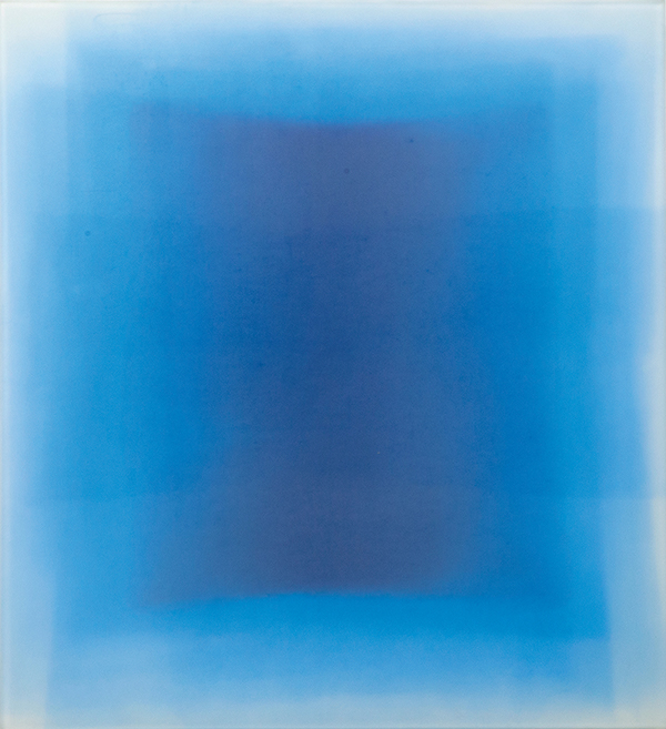
Kim Taek Sang, Breathing light-orange air 20172, 2017, Water and acrylic on canvas, 57 x 48 cm © Kim Taek Sang
The Sublime in the Depth of Color Fields
Mark Rothko, active around the 1960s, pursued human spirituality through color fields. Although Rothko’s color-field abstraction is filled with color, it does not primarily focus on the forms of color or relationships among them. Rather, his greater intention lies in the uniquely human emotions that emerge through color. Many stories recount viewers moved to tears or experiencing something akin to a religious revelation before his paintings. The color fields imbued with the artist’s contemplation and anguish lead viewers beyond visual experience toward an awareness of the sublime.
Kim Taek Sang’s work likewise values meditative experience as much as the optical effects of color. The countless layers of time, and the artist’s labor of holding nature and light within the surface, make an encounter with the sublime possible. The difference, however, is that Rothko’s surfaces—formed in an era of turmoil as American Abstract Expressionism rose—are colors remaining after concrete narratives have been stripped away, whereas Kim’s surfaces are fully charged color fields that hold the principles of nature and the logic of this land.
For this reason, when he participated in the exhibition 《Damsaekmulsung(潭色物性)》 at Woong Gallery, the title used the character 潭 (“deep pond,” a vessel that can hold something) rather than 淡 (“pale”), despite both being read dam. Even if Rothko and Kim differ in the meanings and methods of color, and in their times and geographies, they share the capacity to offer viewers a sublime experience.
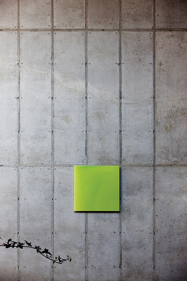
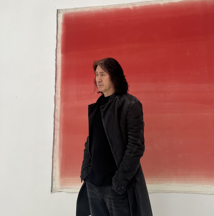
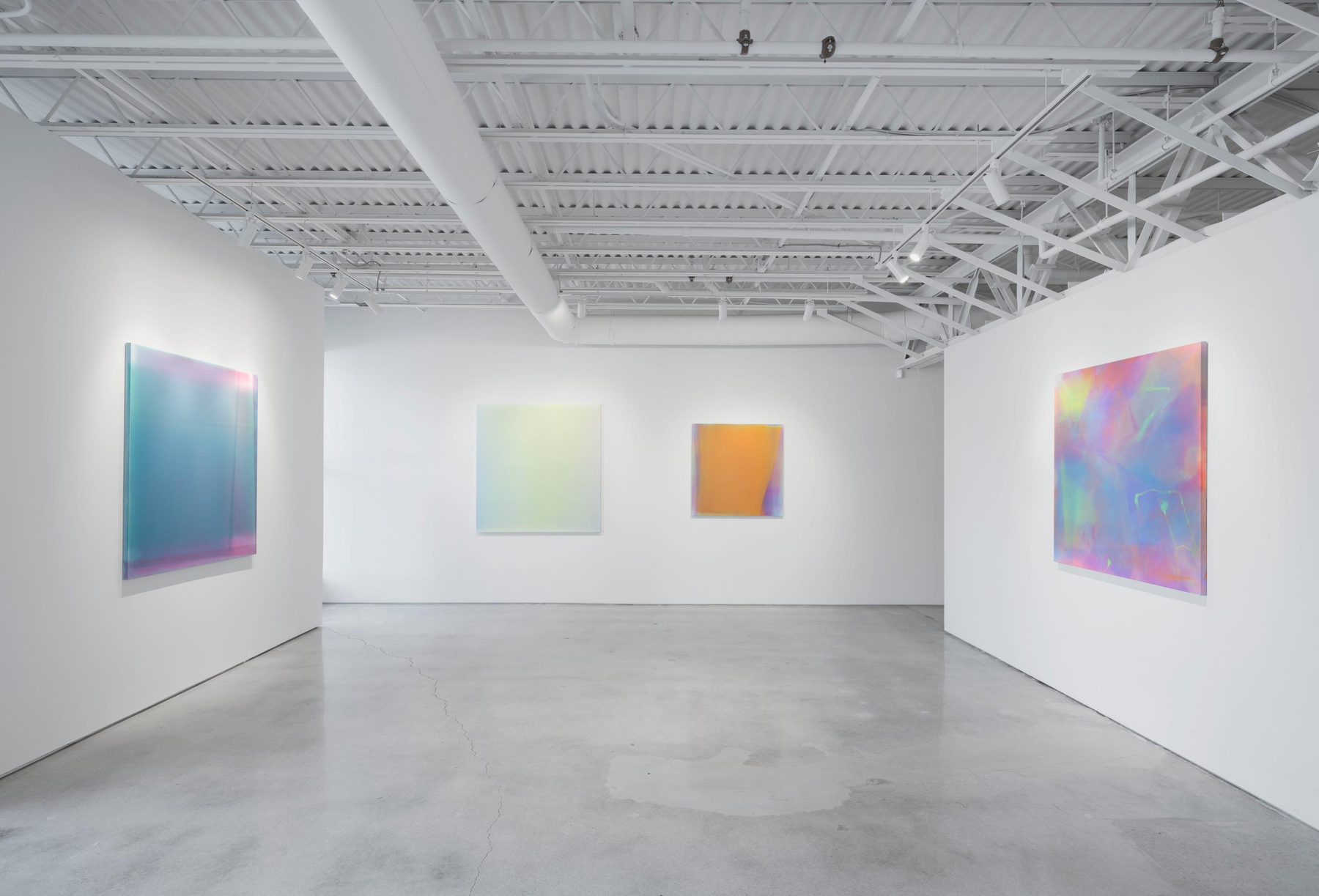
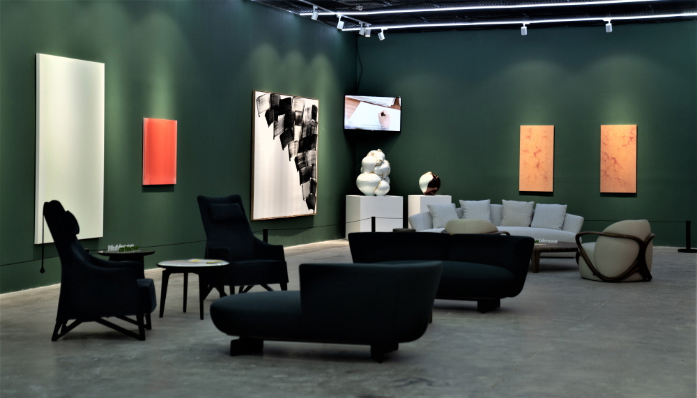
Installation view of 《Kim Taek Sang Solo Exhibition》 © Gallery Aso
There are many reasons Kim Taek Sang has been able to sustain a practice devoted to a single theme for three decades. Chief among them are his ongoing dialogue with the work as he comes to understand Korea’s nature and traditions, and the sense of anticipation that grows in the process. He sought to be faithful to the essence of art and beauty by holding the “light-tones” of nature within the canvas. He also regarded meditation and healing as among the central roles of art, hoping that viewers might heal body and mind by immersing themselves in the work.
Yet just as important as the viewer’s immersive experience is the long making process through which invisible light is rendered visible. For this reason, Kim’s paintings must be looked at slowly, over time, and with careful attention. Only then can one sense the delicacy with which he approaches the work, and the accumulation of fluttering emotions—as if in love—condensed within it. Do not pass his work over simply as a category of color-field abstraction, or as one facet of the Dansaekhwa group. To suggest how one might look at Kim Taek Sang’s paintings, I quote a passage from poet Na Tae-joo’s poem “Wildflower”:
“You have to look closely to see that it’s beautiful.
You have to look for a long time to see that it’s lovable.
You, too, are the same.”