Then wouldn’t it be possible to
hire around 100 assistants?
Yes, I’d like to do that too. But I can’t
really afford to pay someone three million won per month. Sometimes I even find
myself wondering, “Why am I doing this?” After all, this isn’t a type of work
where brushwork is the key element.
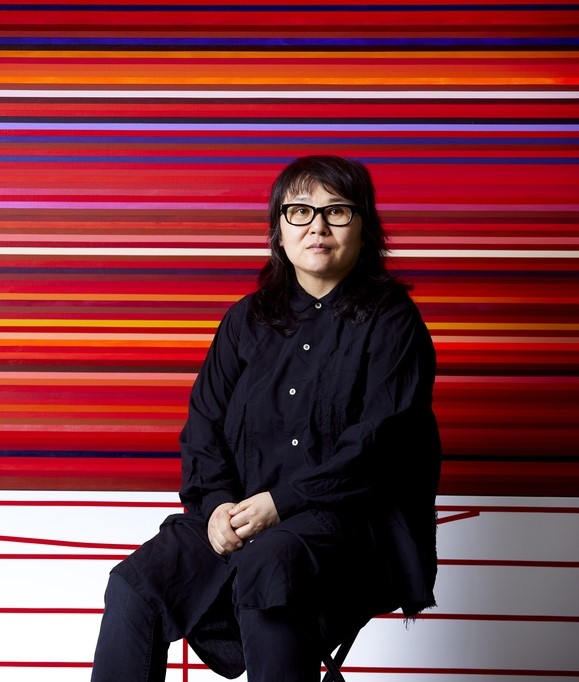
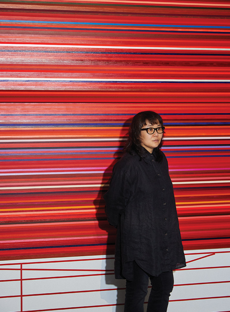
It seems like you are erasing the
artist Park Meena from the work.
I’ve been like that since my school days.
In critique classes, I was often put in situations where I had to explain what
is subjective and what is objective. I thought deeply about why I kept being
placed in that position, and I realized that I’m less interested in what I see
and feel, and more interested in what we see—what our average or median
perception is. That’s why this work is about finding the totality of paints we
use in 2023, not the colors I personally like.
So you are also eliminating
chance.
But chance can never be completely
eliminated. Even though I’ve established a methodology, situations always arise
where I have to make choices within that system.
For example?
Let’s say I go to Hangaram Art Store and
Homi Art Store, the largest art supply shops in Seoul, to collect paints. I
researched the entire database of acrylic paints available in Korea and printed
out lists of what could be purchased at each store. While cross-checking the
list with what’s actually available versus discontinued, I discovered that
Speedball also makes acrylic paints.
Originally, Speedball is known for
printmaking inks. It turns out that their acrylic paints were briefly imported
but are no longer available. However, they hadn’t completely disappeared from
the market—there were exactly three left in a discount corner. Then I had to
decide whether to include them as part of the 2023 acrylic paint set. Since
they were already discontinued and only remained in the discount section, if I
had gone a day or two later, I would have completely missed them.
So they are residues of
time.
In the end, I decided to include them.
Returning to the earlier point about subjectivity and objectivity, this becomes
a moment that raises questions about the subtle nature of human choice.
Recently, I interviewed an artist
who said that the artist should function like a mathematical function, so that
their presence does not appear in the work. It reminded me of your methodology.
They cited General Grant’s autobiography, which describes war without a single
adjective. I responded by saying, “All prose is fiction. As long as there is
choice, nonfiction cannot exist.”
General Grant’s example often comes up in
art criticism classes. That’s probably why that artist mentioned it. My work is
also like that—in terms of writing, it has no adjectives. I find adjectives
very difficult. But adverbs are fine.
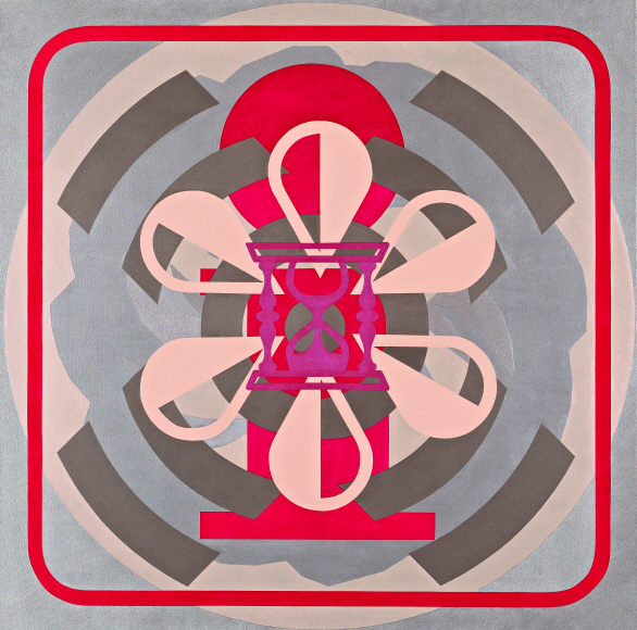
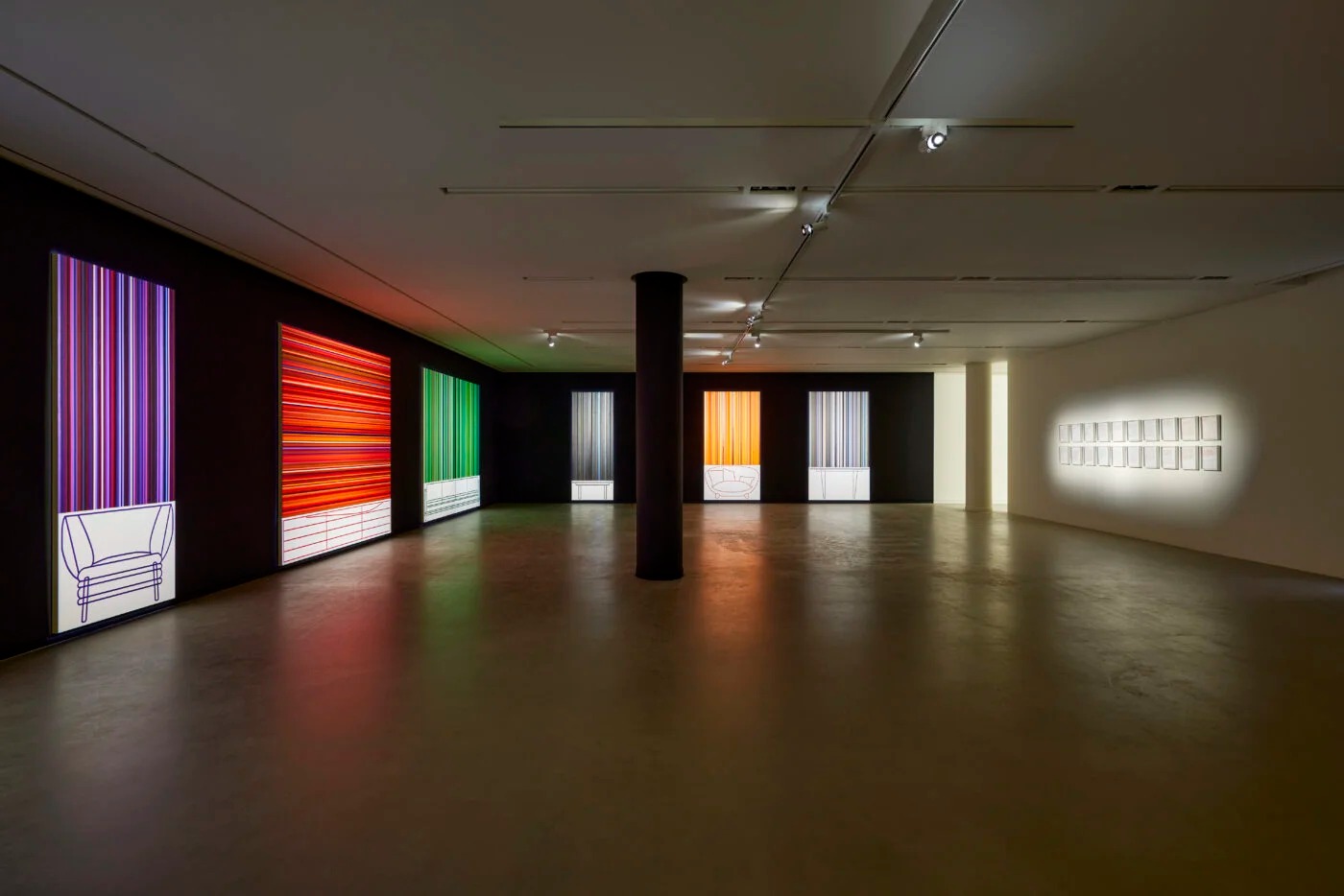
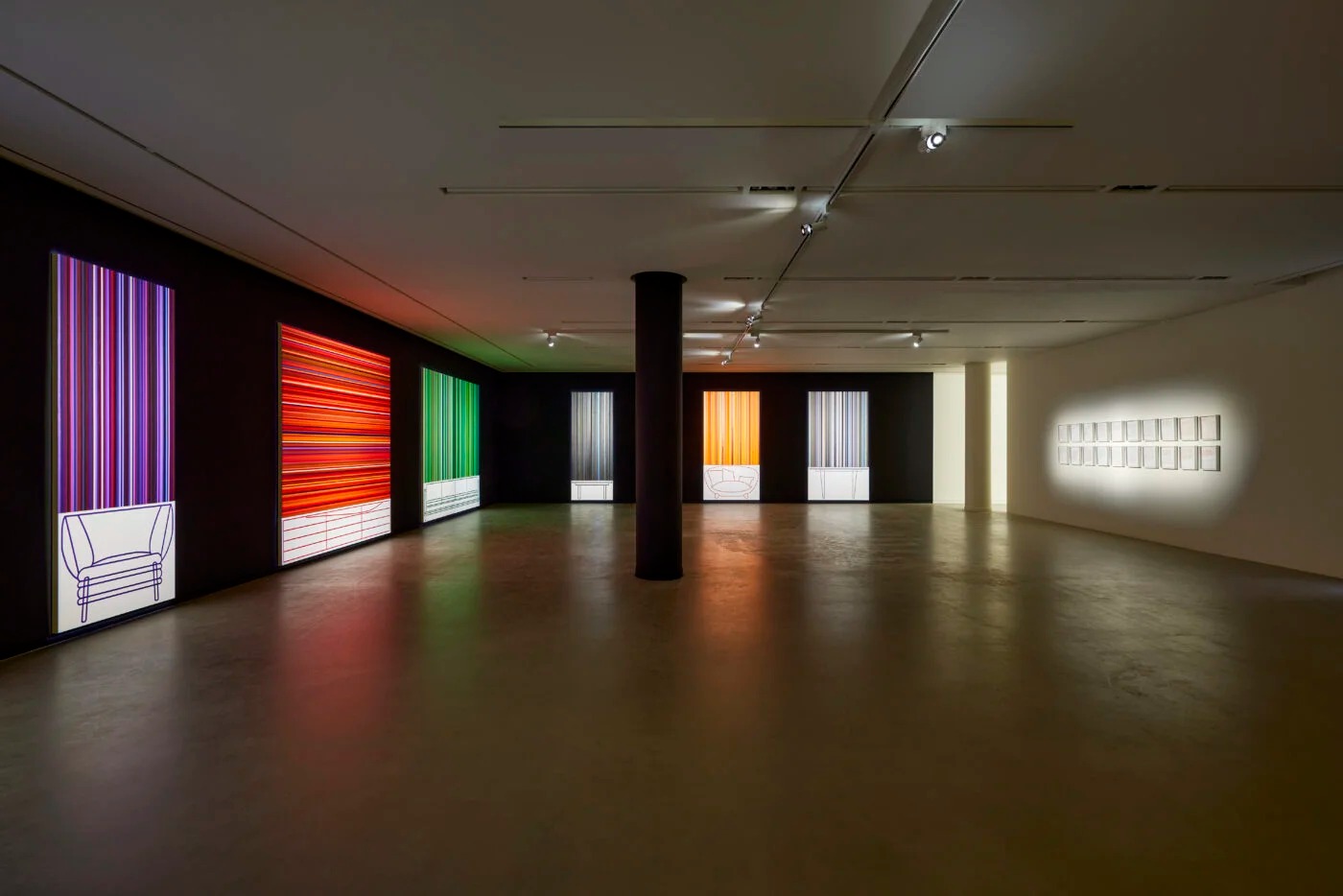
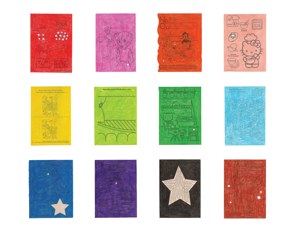
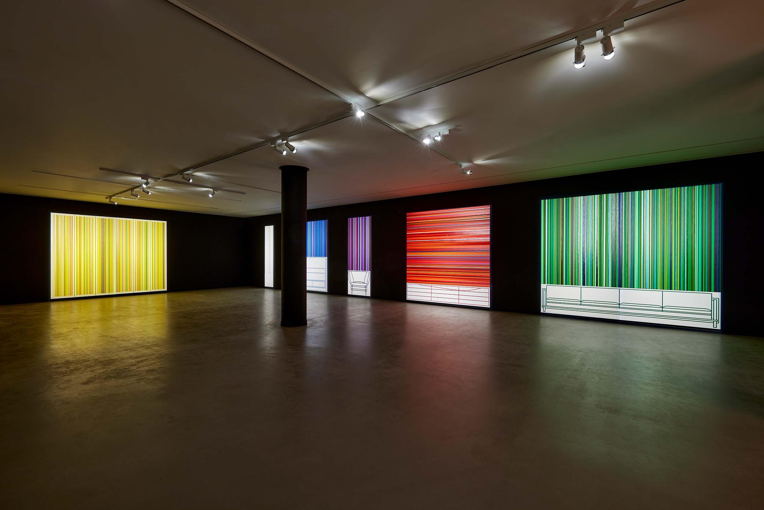
Within a single color, there are
numerous bands, and among them you pair a piece of furniture. How do you decide
that color? For example, in 2023-Yellow-Wardrobe, how do you
choose the line color of the wardrobe?
First, I select the median value from
Golden, the company that first produced acrylic paints. For yellow, there are
names like Cadmium Yellow Light, Cadmium Yellow Medium, and Cadmium Yellow
Dark. Among them, I choose what I consider the middle value—Cadmium Yellow
Medium.
What is the most urgent change
happening in the world of acrylic paint today?
To explain how the number of colors has
increased, cadmium is a good example. Cadmium is a chemical pigment used in
paints like yellow and red, but it’s very harmful to health. So nowadays,
“cadmium-free” paints like Cadmium-Free Yellow Light and Cadmium-Free Yellow
Medium are being produced. They don’t contain cadmium but are designed to
resemble its color. These didn’t exist in 2004.
Like gluten-free noodles that
perfectly mimic the texture of traditional noodles.
Exactly. In 2023, cadmium-free paints are
almost completely replacing cadmium paints, and it even seems like the label
“cadmium-free” itself might disappear. There are many connections here between
art history and sociology.
Vladimir Nabokov once compared
painting and narrative arts, saying that while a painting can be perceived all
at once before moving into details, a text must be read sequentially over time.
That suggests painting is an art form with less intervention from time and
memory.
There was an artist, Barnett Newman, who
experimented precisely with how time is experienced in viewing. He created
massive works over two meters tall and instructed that they be displayed in
narrow corridors, so viewers couldn’t step back to see the whole image. Even
though viewing the entire work without stepping back doesn’t take long, walking
alongside something larger than your body was a new experience. This was a
major turning point in art history, leading to the expansion of time and
movement in art, and eventually to installation art. In my case, however, I
think I went in the opposite direction. I discussed this with Director An
Soyeon.
So that’s why Director An used
phrases like “containing space” and “transforming into installation.” That’s
fascinating. It reminds me of an idea—combining hundreds of bass drum samples
mathematically into a single waveform and fixing that waveform as a line on a
flat surface. Like slicing a cross-section of sound.
Yes, that’s right. When I was an
undergraduate, I kept thinking about similar ideas. One work involved walking
and, every 100 steps, holding a transparent acetate sheet at arm’s length and
drawing exactly what I saw. I brought those drawings back to the studio,
divided them into a grid, mathematically averaged the colors and lines, and
created a painting from that. It’s quite similar. That’s how my thoughts flow.
In your interview with Director
An in the catalogue, you mentioned Rembrandt’s earth tones and Titian’s
ultramarine blue as important examples in the history of paint.
There’s a reason I mentioned those. In
Rembrandt’s time, everything in paintings appeared in earthy tones because
pigments were originally derived from soil. That’s why many paints were named
after the regions they came from—like Yellow Burnt Sienna or Burnt Umber.
“Burnt” refers to whether the earth was heated or not—there’s Raw Sienna and
Burnt Sienna. Then came blue pigments, which are rare in nature.
Ultramarine
was made by grinding lapis lazuli, a mineral still found only in Afghanistan.
When Michelangelo painted the Sistine Chapel, this pigment was more expensive
than gold. It was even used in contracts. One of the reasons Impressionism
emerged was that ultramarine began to be chemically synthesized and
mass-produced in France, lowering its cost, and that paint started being stored
in tubes, making it portable. Artists could finally go outside to paint.
Were there other changes you
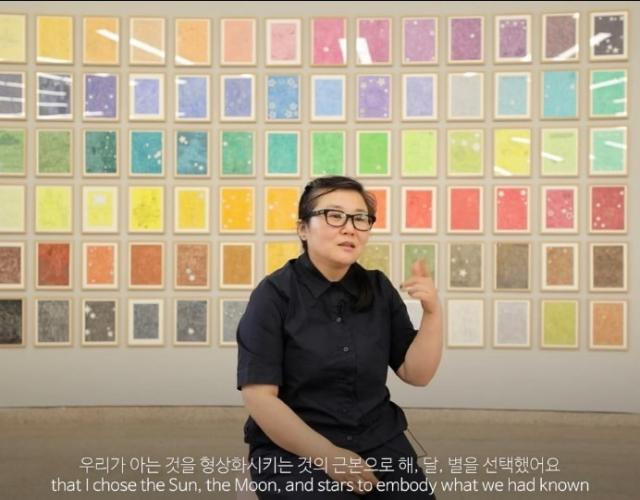
noticed while collecting 1,134 acrylic paints?
I think there are about four major
changes. First, as mentioned earlier, cadmium-free paints have become dominant,
and the term itself may disappear. Second is the application quality of “hue”
paints. Back in 2004, when I was teaching, we told students not to use paints
labeled “hue.” It was obvious—people compared it to banana-flavored milk.
If
you want a banana, you don’t drink banana milk. But technology has surpassed
that limitation. Now, in some cases, hue paints perform better than the
originals. For example, Cerulean Blue—its pigment is unstable, so Cerulean Blue
Hue often applies better and has superior quality.
That reminds me of chemically
reconstructed whiskey.
Another change is the rise of pearlescent
pigments. In the past, iridescent pigments were still experimental. Only a few
companies, like Pebeo, developed them. Now they’ve stabilized, and almost every
company produces them. Lastly, I believe we are approaching an era of
custom-made paints.
Like the color charts we saw earlier, paint colors are
currently fixed. But technology is advancing to the point where, like a
Photoshop gradient, you can select a coordinate among tens of thousands of
options and have that exact color produced. It hasn’t reached Korea yet, but
Golden is already doing this. Eventually, color names may disappear, replaced
by numerical coordinates.
Even then, wouldn’t there still
be other factors like viscosity or texture?
Those can also be selected. You can choose
matte or varnish finishes as well.
Thinking about whiskey again,
similar reductionist shifts seem to be happening across fields. Your work could
be interpreted in that way.
That’s why I told Director An that I might
not be able to do this work again. If color names disappear, the work itself
becomes impossible. Among my various bodies of work, this is the only one I’ve
continued across time as a series. I felt this might be the last opportunity,
so I wanted to mark the coordinates between the work from 19 years ago and the
work today.